Hi, I’m Chirag Agarwal, the delivery manager for Civil Service Learning’s new digital service.
The team at CSL has just completed an alpha - a working prototype of a new digital service. In alpha, we wanted to find out how learning could be more personalised, relevant and informal. My colleague, Neha Datt, wrote the blog Learning to be a better civil service when we first started the alpha.
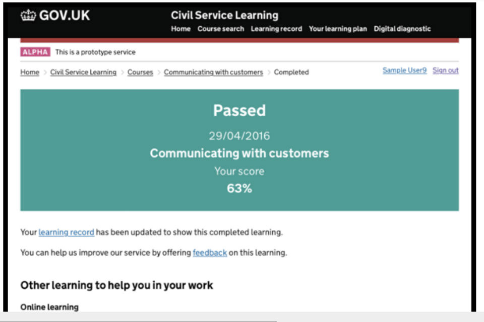
Our alpha has now ended, and you can take a look at the prototype here. Click on 'Start user journey', and use sample.user14@email.com to login. Once you’ve completed the course(s), you can clear your learning history and pretend you’re a new user.
We’re very excited by the journey we’ve been through. Here’s what we’ve learnt.
Users need and want simplicity
When we started alpha, we had some great insights and exciting ideas from our user research sessions. We thought we knew what our users needed and wanted.
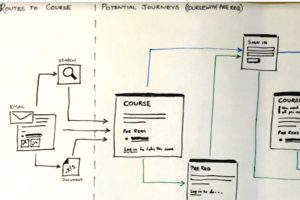
Soon after we began, we turned some of these ideas into design components (sometimes called sketches or wireframes). We thought our users would love them. And they did.
Although these components tested well, overall our users were confused about the wider context. For instance, while the ‘learning suggestions’ were very popular as a concept, users were unsure how to find the suggestions page,why certain things were being suggested to them, and what they could do next with the suggestions.
So, we did the hard work to make it simple: we redesigned what our users needed, based on a specific scenario.

We tested the entire journey a user goes on when they learn something. This time we suggested learning at the end, when they may want to build on what they’ve learnt. This time, the service was intuitive enough so all our users succeeded the first time.
From this experience we learnt that, first and foremost, our users need, and want, simplicity.
And sometimes that’s the hardest thing to get right.
Evolution not revolution
In alpha we tested a lot of innovative ideas about how to improve the service with our users. But we soon found that service ideas had the greatest impact when they were in a scenario the users were most familiar with. For example, starting the learner journey with mandatory learning really hit a chord - this is what most people use Civil Service Learning for. We added in more radical ideas, such as intelligent suggestions, learning wish-lists, etc., which tested consistently well.

Also, user needs change once users feel they trust the service.
Users needed less context on why learning activities were suggested for them, as the quality of the suggestions improved. There's a need to trust the service, and when that fundamental need is met (in this case, by providing a simple, quality service that did what was expected), other lower-level needs diminish. As obvious as it seems, this was a revelation when we saw it in practice.
We learnt how important it is for services to be designed around the scenarios users are familiar with, and for users to trust the service. It's all about evolution rather than revolution.
The unit of measurement is the team
We started alpha with a newly formed, diverse team, with a rich mix of personalities. We’ve had our fair share of disagreements and changed our ways of working more times then I can count. But I honestly believe we are better off for the experience.
Over time we’ve come to trust each other, challenge each other and settle into a rhythm of research, design and build that accommodates everyone in the team.
And although we’re proud of our alpha prototype, we’re even prouder of the team we became, and the potential we have to take our insight and learning and build something amazing.
We’ve learned that a measure of progress, as much as what you’ve delivered, is how the team has formed in the process of delivery, and what you’ve learned together.
Let us know what you think
Some members of our team will take what we've learned back to Civil Service Learning's live service. There are already some big changes to the learning on offer, as outlined in John Fitzpatrick’s blog on A site better for learning.
Meanwhile, have a look at our alpha prototype and let us know what you think. You can comment below or reach us at csl-digital-services@digital.cabinet-office.gov.uk.

7 comments
Comment by Janet posted on
Well done. I have just user tested the Prototype and found it easy to use and understand.
Comment by Sharon Bolton posted on
Sharon - I like the more intuitive CSL, however I do have some comments which I have tried to email and IM directly to CSL team, but they are not allowing emails through. Has anyone else tried to forward comments? Any help would be appreciated. Thanks all!
Comment by Mel posted on
I have just user tested the Prototype and found so much easier to use than what is currently in use! Great work! Lets get it in full working order ASAP!!! 🙂
Comment by Tim posted on
This looks good, thanks for sharing the alpha in this way.
When I was exploring the alpha, one of my results pointed me towards an external supplier's website. I represent a supplier to CSL and wondered whether the recommendations I'm seeing here are simply placeholders, or have the recommended companies been confirmed as new suppliers?
As suppliers we haven't heard much from CSL lately, so it'd be good to understand where these recommendations come from.
Comment by Adam posted on
Thanks for the update - I tried the prototype using your instrcutions but was met with 'you don't have a user account yet'... anyone else met this problem, or succeeded?
Comment by Adam posted on
Scrap the previous comment - I managed to access 3rd time lucky!
Very simple to follow...and if simplicity is your aim your have over-achieved. However it just feels a little dull and boring... can you not liven up with some visuals at this stage?
Comment by Blue Skinned Beast posted on
The alpha prototype looks great. Very easy to read and simple to use. Great work and I congratulate you all !